Journal
-
21May’14
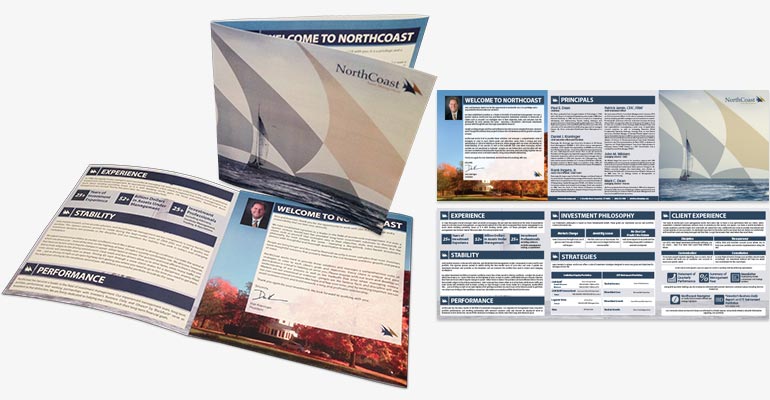
Designed to accompany all new account paperwork and compliance materials, this tri-fold welcome brochure is intended to give new clients an overview of NorthCoast's investment principles, experience, and company philosophy. See more NorthCoast marketing materials...
-
30Apr’14
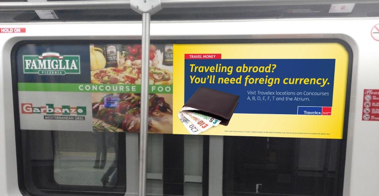
Atlanta Airport SkyRail Advertisement
Posted by Rob Hyatt in Branding and Displays/Signage
Installed in the Atlanta Airport SkyRail, this series of Travelex advertisements are intended to build currency exchange awareness in international depature terminals. View more airport ads...
-
28Apr’14
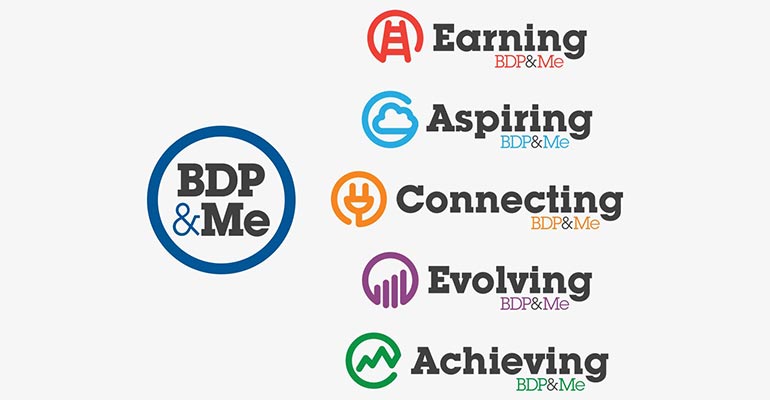
Working with the BDP International HR team, we created a brand identity system which reflected the principles of each HR program. The BDP&Me identity was built using a set of sub brands which contain a common elements, this allows for flexibility in future brand expansion. Learn why building an expandable brand is important...
-
05Mar’14
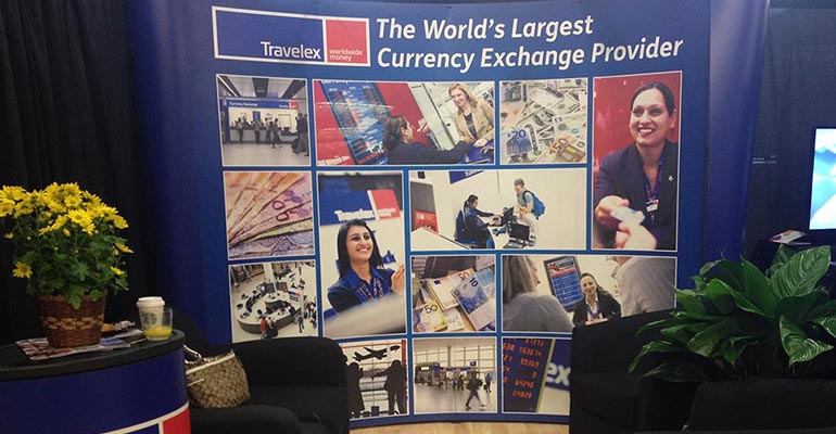
Travelex ARN Booth Banner
Posted by Rob Hyatt in Branding and Displays/Signage
The intent of this tradeshow booth was to highlight the global presence of the Travelex brand at the 2014 Airport Revenue News (ARN) Conference. Take a look behind the scenes...
-
07Feb’14
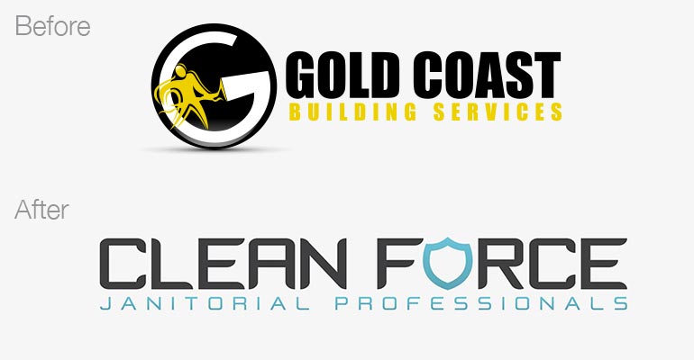
Clean Force Re-Branding
Posted by Rob Hyatt in Branding, Logos and Rebranding
The company formally known as Gold Coast Building Services, is now Clean Force Janitorial Professionals. We worked with ownership to reposition and rename the brand so it captured the voice and competitive advantages of the company. Learn more about the rebranding process...
-
24Jan’14
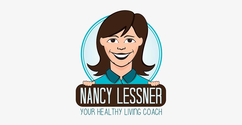
Nancy Lessner is a medical nutritionist and 'your healthy living coach'. We worked with her business developement expert to develop a brand which would be relatable for both kids and parents. Explore our branding process...
-
01Jan’14
NorthCoast Performance Reporting Rebranding
Posted by Rob Hyatt in Branding and Rebranding
After four years of managing the performance updates for NorthCoast Asset Management, we were given the opportunity to redesign their existing reporting tools.
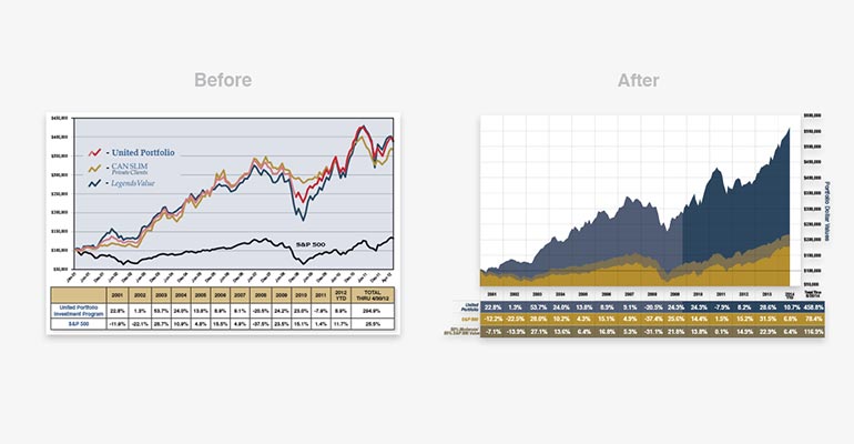
By performing a gap analysis and establishing where the fact sheets and brochures are now and understanding where the NorthCoast marketing team would like them to be, we're able to establish goals and track growth.
-
20Dec’13
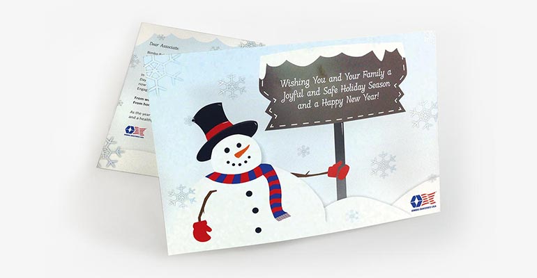
2014 BBU Holiday Card
Posted by Rob Hyatt in Branding and Print Design
The whole CSD team had fun creating holiday card designs for Bimbo Bakeries USA. These cards were distributed to all 25,000+ associates across all of North America. See more holiday card designs...
-
15Dec’13
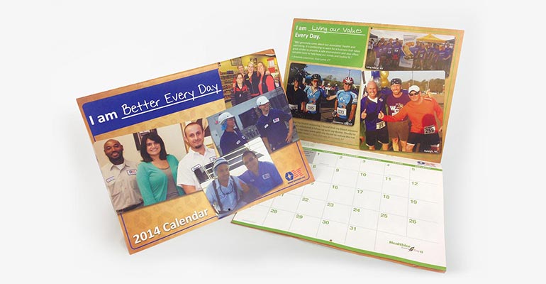
2014 BBU Corporate Calendar
Posted by Rob Hyatt in Branding and Print Design
A Bimbo Bakeries USA associate favorite, the company calendar is distributed to employees yearly. Every year there is a new theme, this year it was "I am Better Every Day" which reflected the HR initiatives that every associate knows and identifies with. Learn more about the calendar design and process...
-
13Nov’13
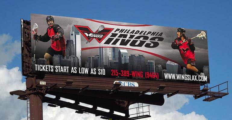
Philadelphia Wings 2014 Marketing Materials
Posted by Rob Hyatt in Branding, Print Design and Displays/Signage
The final Philadelphia Wings season (in the city of brotherly love) was designed to highlight the best player in professional lacrosse; Paul Rabil. Every season we prepare a custom branded look & feel which reflects the specific sales theme, in 2014 the Wings wanted to emphasize they had the best players in the world.
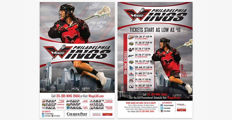
Using the Philadelphia skyline, we made players appear larger than life as they took to the streets and played between towering skyscrapers.
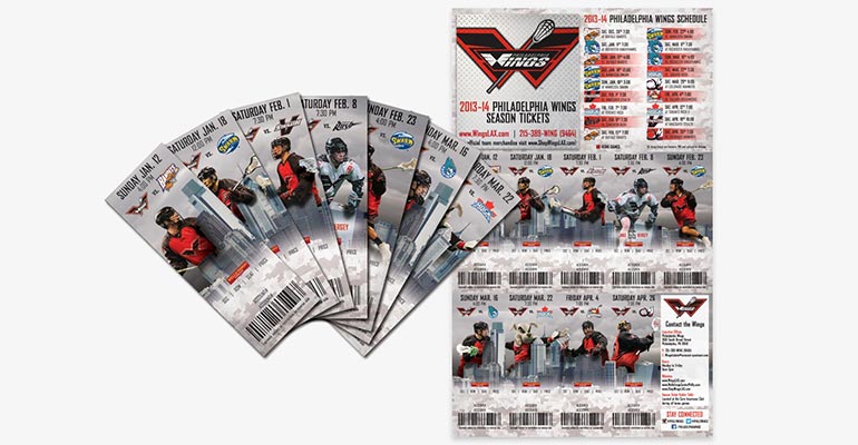
By using the teams tertiary grey color in the skyline and cloudscape, we were able to really make their iconic red/black color scheme stand out. See more marketing materials from the 2014 season...
-
23Oct’13
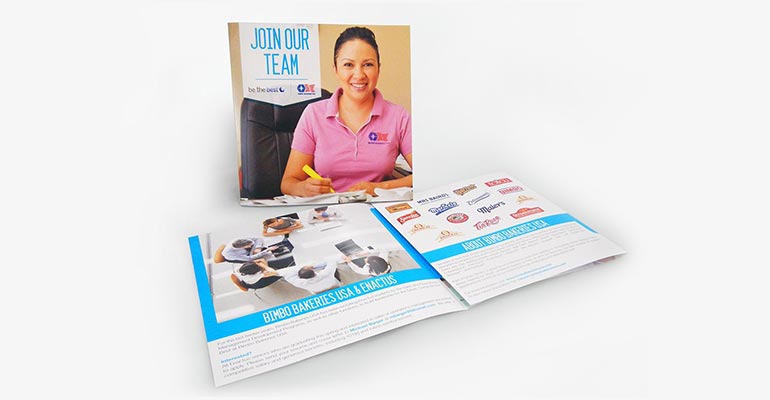
BBU Enactus Recruiting Materials
Posted by Rob Hyatt in Branding and Print Design
To help Bimbo Bakeries USA stand out at career fairs and college recruiting programs, we worked with the communications team to create brochures, promotional materials, and tradeshow displays. One challenge BBU faces is educating candidates about the company, who BBU is, and why they have a competitve corporate environment.
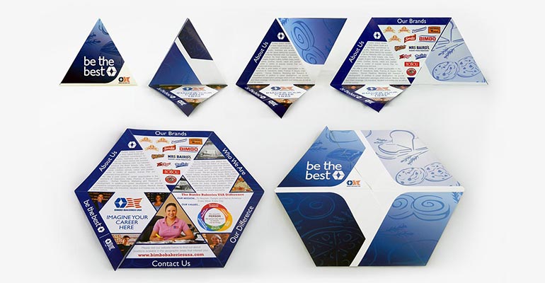
CSD concepted, designed, and produced these custom die-cut folded brochures. See how the custom folds work...
-
24May’13
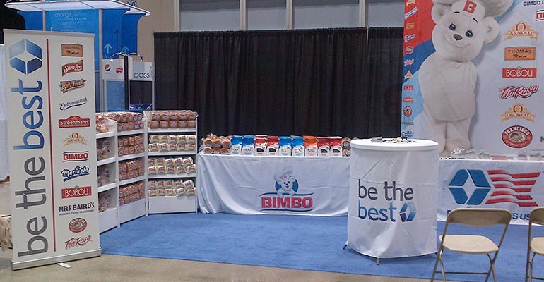
BBU Enactus Trade Show Materials
Posted by Rob Hyatt in Branding and Displays/Signage
The Bimbo Bakeries USA communications and recruiting teams came to us to improve their presence at the Enactus National Contests. Competing against other large global brands like PepsiCo, Hershey's, and Walmart, it was essential for contestants to understand who BBU is. Learn more about the materials we created...
-
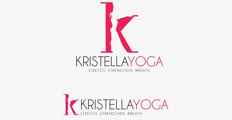
14May’13
A yoga studio that works with kids, Kristella Yoga needed a brand identity that reflected the owner Kristin Cretella's personality. Kristin is a very energetic, active, and positive person, we wanted to capture that energy into a static icon. More about the Kristella Yoga logo design process...